Table of
Contents
Main
Panel

1.
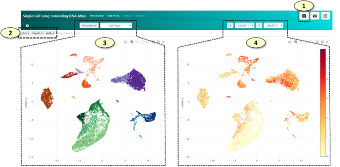
[Capture]
Capture and save the
current view as a PNG image file
2.
[Gene
Search Box] Users can
explore single-cell gene expression patterns of each gene by typing a valid
gene symbol in this gene search box.
l
The
search box has an auto-completion feature that suggests a list of partially
matched gene symbols to the user as a gene symbol is typed.
l
The
summarized gene expression pattern of a gene is instantly visualized as it is
being typed to aid more efficient exploration of our dataset without
downloading additional data from the server.
l
Once
an enter key is pressed, a tag representing the gene symbol (a gene symbol tag)
is added to the gene search box. Next, a compressed data chunk containing an
array of gene expression values of the gene symbol for the current subsampled
(or all) cells is downloaded from our database, parsed in the user's web browser,
and displayed on the web application.
l
Up
to 200 genes can be simultaneously
loaded in the web application by adding gene symbol tags in the gene search box
one by one. A summarized gene expression pattern of each gene can be visualized
by moving a mouse pointer over each gene symbol tag without downloading any
additional data from our web database.
l
By
clicking the 'X' symbol left to the gene symbol in each gene symbol tag, a gene
symbol tag can be removed from the main gene search box. The removal of the
gene symbol tag will lead to the removal of the single-cell-level gene
expression values for the gene symbol from the memory, thus freeing unnecessary
memory used by the web application
3.
[UMAP
Plot for Cell Annotation]
Users can explore annotation labels of the cells on a UMAP graph. The type of
annotation labels can be changed by selecting a different annotation in the
selection tab located above the UMAP plot.
4.
[UMAP
Plot for Gene Expression] This
UMAP graph will visualize normalized and log-transformed gene expression values
of individual single cells using the UMAP coordinates of each cell.
l
Clicking
a cell on either of the UMAP graphs will trigger downloading of the list of
cell marker genes for the cluster to which the cell belongs, which will be subsequently
visualized in the [Cell Marker Panel]. The list of cell markers can be
downloaded as a CSV file by clicking the 'Download' button located above the
table displaying the marker gene list.

l
Users
can zoom in on a specific region of the UMAP plot by selecting the region when
a magnifying glass symbol is active on the toolbar on the upper right side of
the UMAP graph. The zoom level can be reset by double-clicking the plot
background where no cells are present or clicking the "home" button
at the plot toolbar.
l
The
two UMAP plots, the cell annotation and gene
expression UMAP plots, will always display the same region of a graph,
visualizing cell annotation labels and gene expression levels of the cells,
respectively. The change of view of one UMAP plot will be automatically applied
to that of the other UMAP plot.
l
Additionally,
users can change x-axis or y-axis values from UMAP coordinates to gene
expression values of a gene of interest by (1) selecting the 'gene' option in
the selection tab next to either the 'X' or 'Y' labels above the [UMAP Plot
for Gene Expression] plot and (2) clicking the gene symbol tag in the gene
search box. After the change of an axis, the axis label will be updated from
'UMAP-1' (or 'UMAP-2') to the gene symbol that has been selected to represent
the axis. The axis can be changed back to the UMAP coordinates by selecting the
'UMAP-1' (or 'UMAP-2') option in the selection tab.
Sidebar

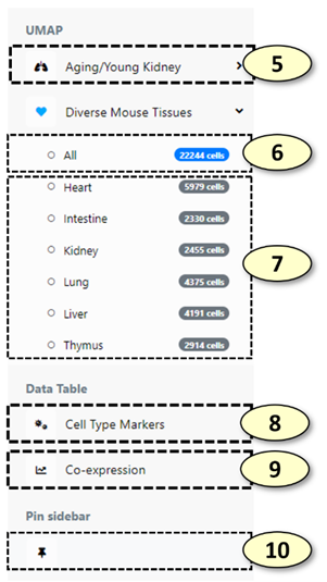
5.
[Explore
a dataset] Click to see
the samples (conditions) available for the dataset.
6.
[Load
all cells of a dataset] Load
all cells of the dataset. The number of cells in the blue badge indicates the
total number of cells in the dataset.
7.
[Load
a subset of cells of a sample] Load
cells of a sample (or a condition). The number of cells in the grey badge
indicates the total number of cells for the sample/condition.
l
Internally,
when the user visualizes a gene, expression values of the gene are downloaded
together, and changing a dataset or sample (without changing a gene) will not
download the expression values of the gene redundantly (also, these expression
values are cached, and up to expression values of 200 genes will be kept in the
memory).
8.
[Cell
type marker table] Show/hide
the cell marker table of the cell type of interest. The cell marker table is
loaded when the user clicks a cell, which instructs the web application to
download cell markers for the cell type of the clicked cell. The cell marker
table can be downloaded by clicking the download button above the table.
9.
[Correlated
gene table] Show/hide
the table of correlation results, which contains a list of genes whose
expression values are correlated with the currently active gene for the current
sample/condition/dataset. The table is loaded when the user loads a gene or
changes the sample/condition/dataset, which instructs the web application to
download a list of correlated genes for the cell type of the clicked cell. The
cell marker table can be downloaded by clicking the download button above the
table.
10.
[Sidebar
control] Maximize/minimize
the sidebar, allowing more space to display the graphs.
l
In
mobile environments where the screen size is small, sidebar
will collapse and will not appear at the left side of the application. In this
case, clicking the green floating button at the top right of the application
will show the sidebar again.
Violin
Plot

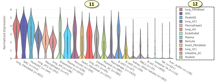
11.
[Violin
plot] For the cell
types of the current sample/condition/dataset, expression values will be
visualized as a violin plot and will be sorted by their average expression
values, resulting in a cell type with the highest average expression values at
the left side and a cell type with the lowest average expression values at the
right side. The plot can be zoomed in by selecting a region to zoom through a
click-and-drag action. The zoom level can be reset by clicking the plot
background or clicking the
"home" button at the plot toolbar.
12.
[Violin
plot legend] Violin
plot of each cell type can be included/excluded from the plot by clicking its
corresponding label in the plot legend.